ShopDreamUp AI ArtDreamUp
Deviation Actions


Suggested Deviants


Suggested Collections


![[f2u] Youre Not Safe Here](https://images-wixmp-ed30a86b8c4ca887773594c2.wixmp.com/f/e5bdc42c-fcad-40ee-8284-dbfefbb1ff7c/damyxey-d3b16c32-9b78-48e1-a43d-6ea22e8e5d12.png/v1/crop/w_115,h_106,x_2,y_0,scl_1/_f2u__youre_not_safe_here_by_loudlytransparent_damyxey-92s-2x.png?token=eyJ0eXAiOiJKV1QiLCJhbGciOiJIUzI1NiJ9.eyJzdWIiOiJ1cm46YXBwOjdlMGQxODg5ODIyNjQzNzNhNWYwZDQxNWVhMGQyNmUwIiwiaXNzIjoidXJuOmFwcDo3ZTBkMTg4OTgyMjY0MzczYTVmMGQ0MTVlYTBkMjZlMCIsIm9iaiI6W1t7ImhlaWdodCI6Ijw9MTA2IiwicGF0aCI6IlwvZlwvZTViZGM0MmMtZmNhZC00MGVlLTgyODQtZGJmZWZiYjFmZjdjXC9kYW15eGV5LWQzYjE2YzMyLTliNzgtNDhlMS1hNDNkLTZlYTIyZThlNWQxMi5wbmciLCJ3aWR0aCI6Ijw9MTE1In1dXSwiYXVkIjpbInVybjpzZXJ2aWNlOmltYWdlLm9wZXJhdGlvbnMiXX0.-PKPOLUdXwfSloveftrXWxxgXTUAYKVmBDvZ9VHi6rU)
![[f2u] Youre Not Safe Here](https://images-wixmp-ed30a86b8c4ca887773594c2.wixmp.com/f/e5bdc42c-fcad-40ee-8284-dbfefbb1ff7c/damyxey-d3b16c32-9b78-48e1-a43d-6ea22e8e5d12.png/v1/crop/w_92,h_92,x_2,y_0,scl_0.86792452830189/_f2u__youre_not_safe_here_by_loudlytransparent_damyxey-92s.png?token=eyJ0eXAiOiJKV1QiLCJhbGciOiJIUzI1NiJ9.eyJzdWIiOiJ1cm46YXBwOjdlMGQxODg5ODIyNjQzNzNhNWYwZDQxNWVhMGQyNmUwIiwiaXNzIjoidXJuOmFwcDo3ZTBkMTg4OTgyMjY0MzczYTVmMGQ0MTVlYTBkMjZlMCIsIm9iaiI6W1t7ImhlaWdodCI6Ijw9MTA2IiwicGF0aCI6IlwvZlwvZTViZGM0MmMtZmNhZC00MGVlLTgyODQtZGJmZWZiYjFmZjdjXC9kYW15eGV5LWQzYjE2YzMyLTliNzgtNDhlMS1hNDNkLTZlYTIyZThlNWQxMi5wbmciLCJ3aWR0aCI6Ijw9MTE1In1dXSwiYXVkIjpbInVybjpzZXJ2aWNlOmltYWdlLm9wZXJhdGlvbnMiXX0.-PKPOLUdXwfSloveftrXWxxgXTUAYKVmBDvZ9VHi6rU)


You Might Like…


Description
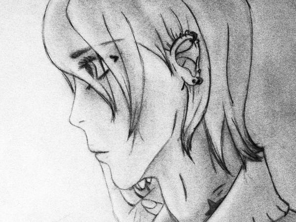
I HAVE NO IDEA WHY THE PAPER'S THAT FUNNY YELLOWY COLOR!!!TT__TT
random dude I drew. pretty sweet? no.
critique me, or I kill you with laser guns!!
Edit: fixed the color!! yays. :gonk:
random dude I drew. pretty sweet? no.
critique me, or I kill you with laser guns!!
Edit: fixed the color!! yays. :gonk:
Image size
3072x2304px 1.89 MB
Make
Canon
Model
Canon PowerShot A470
Shutter Speed
1/79 second
Aperture
F/3.5
Focal Length
10 mm
ISO Speed
400
Date Taken
Mar 21, 2009, 10:58:59 PM
© 2009 - 2024 Conspiracy-Z-Cycle
Comments4
Join the community to add your comment. Already a deviant? Log In
I actually really like that 'funny yellow color', in fact, I find it really enhances the picture.
Critique or you will kill with laser guns?!
Right! CRITIQUING TIEM!
GET RID OF THE FREAKING DEVIANTART WATERMARK. To be blunt, you have like, 74 pageviews. Covering your art with that hideous thing isn't going to make people more attracted to it. I realize you probably want to "protect your art" but all that does is DEFACE your art. It's too big, smack in the middle of it and I can barely see the picture through it. Make your own watermark if you need to mark it. You obviously got your picture onto the computer, so surely you have some way of putting text on it yourself. Do that. I really feel it's defacing especially this picture, as it's not very large or detailed to begin with. It ruins the minimalism of your lineart.
Right now, at your stage of DeviantArtfulness, it'd be better to display your art rather than hide it with hige watermarks. Think small, and boldly display your art!
Now on to the art that's sort of difficult to see behind the watermark.
It's a guy? Srsly? I'm not finding I believe that. He looks more feminine than the average bishie. More feminine than me, anyway... ^_^
Your lineart is crisp and clean, and I like that. It looks neat with the pencils on this yellowish paper and adds some sort of interest to the otherwise 'just lineart'. I also find it enhances the loneliness presented in the title. I like the soft and blurry bits of pencil shading combined with the crisp, yet soft lines.
His eyes are a little bit high, I think... can't quite see through the big mark...
I love the soft shading on the neck and cheeks. It seems almost airbrushed and I think it really enhances the dreaminess of this sketch. So yeah, pretty sweet.
/critique
Good luck on DeviantArt and with your art! Always good to see traditional art around here! And welcome! A month's not really that much time, anyway... >.>